Masthead tutorial, sort of
A couple nights ago I put up the new March masthead (if you can’t see it try emptying your cache and refreshing your browser), and since then I have been asked quite a bit about some of the techniques I used to design it. Oddly, this particular masthead took me less time to design than most. Sometimes it takes hours and hours over the course of a week for me to finalize one because I can’t settle on a specific color or theme or whatever, and by the time I lock into something I like I’ll have gone through eight or nine revisions. I didn’t used to be this way with design, at least not until one of the creative directors I worked for in Los Angeles forced me to do almost 25 different versions of the Paul Mitchell website. He drove me INSANE, but by the end I absolutely loved what I had done. He’d been right, and I had a hard time admitting that, especially since he wore green garden clogs to work every day. EVEN WITH SUITS. Makes Jon look like Oscar de la Renta.
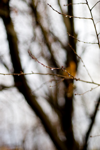
I started designing this masthead with a photo that I took a few weeks ago during a rainstorm:

I next made a copy of the photo and applied what’s called a Color Halftone on it (under Filters in Photoshop), and this is the result:

And then I randomly grabbed this bluish-purple color for the background, a little bit Barney, a little bit Papa Smurf:

I usually don’t settle on a background color until much later in the process, but once I started playing around with the transparency of the photo layers over this color I really liked what was happening:

The Color Halftone layer is set to “Overlay” and I reduced its transparency to 10%. The photo layer above the Color Halftone layer is also set to “Overlay” but I kept its transparency at 100%. If you play around with the layer properties and transparencies you get all sorts of groovy effects. I liked this one best.
Next I found an image of a butterfly from a relatively cheap book of clip art that we picked up at a local Barnes and Noble (you can order it online as well):

I replicated it several times, scaled it to different sizes and then scattered them throughout the branches in the image. I liked the contrast between the photographic image and the illustrative nature of the butterfly. Look at me, trying to sound like I have any idea what I’m talking about.
I liked where the design was at that point, but then wanted to see if I could nudge it a tiny bit further, and this is where I always bring out the Jason Gaylor Photoshop brushes. I cannot emphasize enough how much I have used these brushes in my mastheads, particularly these Fresh Foliage brushes and the Japanese Foliage brushes. The one used in this month’s masthead is from the Japanese set:

I try not to go crazy with the brushes because it’s very easy to get out of hand and make it look like Photoshop spilled diarrhea all over the design. But it’s very hard to resist because these brushes are so much fun to use. These brushes are the bourbon-dipped Dorito lap dances of Photoshop.
The font I used for the tagline is called Copperplate, and it is one of the thousands of fonts that Jon brought into our marriage. He also brought with him a lot of Steely Dan, but I have forgiven him for that because he’s very old and has trouble hearing.

And finally, the tagline itself, which was suggested to me by a reader named Dave who promises that he didn’t mean it literally, just that it seemed to jive with what goes on here. I’ll have you know that I take my mediocrity very seriously. It is something I have spent years perfecting and embracing and snuggling with under the covers. If I weren’t reveling in my mediocrity I would probably feel so guilty about watching America’s Next Top Model that I’d have to turn it off and read a book. PLEASE DON’T EVER LET THAT HAPPEN TO ME.