Far better than quarterly taxes, I can assure you

A few weeks ago my second Quarterly package shipped, a box full of delightful materials collected around the theme of handwriting. What has been so fun about these collections is seeking out a topic that enables me to work with artists I admire and including their work in what is sent out to subscribers. In the first package I sent out, one focused on my home state of Utah, I got to work with Jeni Shirley of Stitched Cards. For every single shipment she hand-stitched cards with an image of Delicate Arch and the outline of downtown Salt Lake City:

This kind of collaboration is what makes these packages so special: a storyteller like me working with a maker as talented as she is to produce something entirely unique. It’s work that I have thoroughly enjoyed.
In the second package I got to join forces with an artist I have admired for years, a local Utahn named Melissa Esplin whose hand-lettering is so elegant and graceful. I love having her photos pop up in my Instagram feed because her artistry in clothing, crafting and calligraphy is so inspiring. She is the multi-talented Mormon my family probably wishes I could be, so I hope this association alleviates their concern for my eternal salvation just the tiniest bit.
In the letter I wrote accompanying this package I noted:
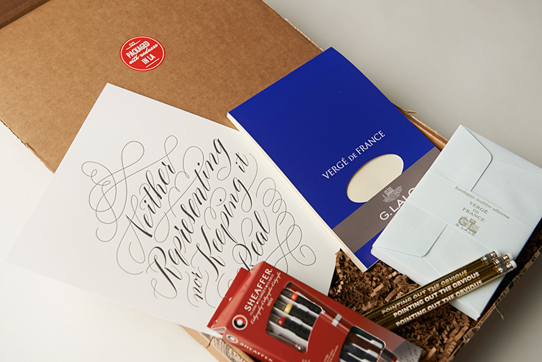
I’ve included an exclusive hand lettered print that we worked on together: her talented hand giving life to a phrase that once served as a tagline on my website. I love the juxtaposition of scripted letters that are so often associated with inspirational and romantic notions being used to render my facetious twist on a popular phrase.
I’m so happy she was willing to go out on a limb with me. The end product is everything and more than I had hoped it would be:

I also got to go out and look for a few other products to include in this collection: a calligraphy kit, a sophisticated writing tablet with accompanying envelopes and a few fancy pencils to keep around for handwritten notes:

(Photo by Will Deleon)
This theme was inspired by the fact that my handwriting has been destroyed by the repetitive muscle movements required by modern technology: texting, mouse-clicking in photoshop, typing on a keyboard. My wrists and thumbs are a mangled mess. I wanted to practice this art form myself. So I did some googling on various calligraphy alphabets and sat down with my supplies. Here is what my first attempt looked like. Keep in mind that I have not touched a calligraphy pen since middle school. That was 25 years ago.


Yeah, I’ve got a long way to go. Also, my handwriting tends to creep up to the right of the page. Like I’m sitting on a boat that is a little too heavy on one side. Ugh. That is so annoying. In fact, it’s bothering me so much that my instinct is to rotate the image and fix it in Photoshop WHICH DEFIES THE WHOLE PURPOSE HEATHER. Sit on your hands and enjoy the gifts of imperfection.


My next Quarterly package ships in about two months (you can subscribe here) and this time I decided on a theme that allows me to work with a close friend who has created such an innovative product that I cannot wait to share it. I am sending up my gratitude here that I have the opportunity to work with artists in this manner, that I can bring attention to their work while simultaneously making strangers smile when they open their mailboxes. I guess this is kind of the same thing as wanting to be a magical fairy when I grow up?
Sign up if you’re curious!
